|
Context and Culture of Knowledge Visualization: Anna Ursyn (bio) University of Northern Colorado Ebad Banissi (bio) VGRU, London South Bank University, UK
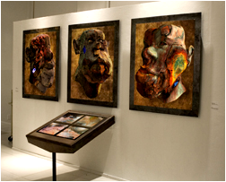
This article provides some notes about the visual content analysis applied to data and knowledge in many domains. These notes refer mainly to the selected articles presented in the Proceedings of iV08, the 12th International Conference on Information Visualization held in London, UK*. Beyond visualization and presentational exploration, the contributors focus on understanding of the language of visualization, along with the interactive context and culture of knowledge visualization. The theme for the 2008 12th International Conference Information Visualization is "Shifting Focus to Content Analysis and Widening Applications." Projects, often conceived as cross disciplinary, comprise information visualization, design visualization, knowledge visualization, cultural heritage knowledge visualization, web mining and open source intelligence, semantic web, applications of graph theory, and visual analytics*. The Symposium and Gallery of Digital Art (D-Art) accompanies the Conference. Art works and short videos from the D-Art 2008 Gallery, along with figures taken from the Conference papers, illustrate this article.
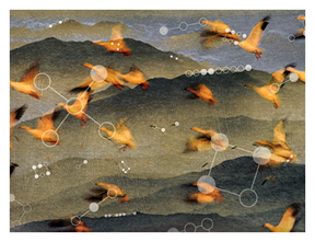
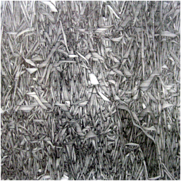
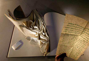
Figure 1. Jing Zhou, Infinity. Digital mixed media on paper Information visualization
Information visualization is sometimes defined as representation + interaction, but interaction is often given only secondary attention (Ji Soo Yi, Youn ah Kang, Stasko, & Jacko, 2007*). Several models of information management address the data presentation, mapping, and temporal dimension issues. According to Cottam and Lumsdaine* (2008, pp. 51-56), the existing information visualization models are insufficient for visualization programmers in creating applications, especially where interaction is concerned. They are either too broad and taxonomy based (which is good for categorizing what has been or needs to be done, but provide little help in accomplishing those goals), or narrowly focused on isolated aspects of the visualization problem (which allow particular aspects of the visualization problem to be efficiently solved, but leave heavy burdens for integrating many such narrow tools together to solve the overarching visualization problem). The authors describe the Stencil visualization model that can guide visualization program construction through several stages of common application pipelines. They employ a declarative Domain-Specific Language called the Stencil Language, thereby overcoming the interaction shortcomings, improving the resulting visualization products, and reducing significant barriers to visualization adoption.
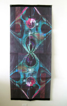
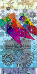
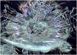
Figure 2. Joohyun Pyune. 0002. Dye sublimation printed on fabrics
Craft and Cairns* (2008, p. 44-50) overviewed methodologies in Information Visualization design and methods for designing novel visualizations. According to the authors, current knowledge comes in the form of:
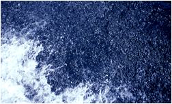
For example, the visualization reference model proposed by Card, Mackinlay, & Shneiderman (1999) describes activities necessary to create visualization systems that include transforming raw data into structured data, as data tables, and then further data transformations allowing for calculations of meta-data attributes. Visual mapping of attributes allows mapping the structures essential to the data into the abstract visual structures that can be interactively transformed on a screen by the users as changes in shape, color, size, location, etc. Figure 3. Monika Wulfers. Blue print, Disturbance 12. Digital Print on Hahnemuehle Photo Rag A novel visualization approach to support understanding microarray data has been implemented in close collaboration with neurobiologists, to analyze and understand data about activity of genes (called as gene expression or gene regulation) and, going one step further, make a switch to combinations of genes (Tominski and Schumann*, 2008, pp. 120-126). Gene combinations bear more information, and hence can lead to new hypotheses about the data. More and more biological experiments are conducted based on microarray technology. The authors present the approach that allows biologists to interactively explore and to visually compare different combinations of genes. They developed an analysis pipeline, for filtering of genes for data analysis, generating gene combinations, then filtering of gene combinations and visualizing several hundreds of gene combinations as multiple panels floating (in a way of small multiples) in 3D. The implementation of the visualization of gene combinations (ViGeCo) is available as a plug-in for the microarray data analysis framework Mayday.
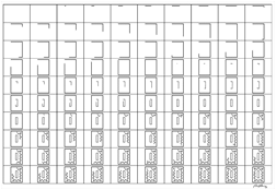
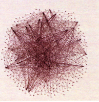
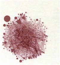
Figure 4. Daniel Durning. 100 Drawings No.1. Chromo Graphic Print on Rag Paper. The phenomenal transformation from the simple line to an iconic ideal. This composition was rendered as a final animation. Another project accomplished in close collaboration with biologists focused on a comparison of metabolic networks (Bourqui and Jourdan*, 2008, pp. 638-643). Large-scale networks such as gene networks, protein–protein interaction networks, or metabolic networks, comprise sets of interconnected reactions that can be modeled as small graphs called metabolic pathways. Networks, often containing hundreds of elements, many times share some biologic functions. Visual mining tool allows mining the newly discovered metabolic networks and comparing them to already known ones. Such comparison could be done using pathways (clusters). The authors helped biologists in their understanding of the different metabolic properties of bacterial organisms belonging to a major group (phylum) of bacteria. By defining color-coded drawing algorithms and navigation methods they visualized the networks and their hierarchies. The network classification hierarchy allowed comparative analysis. Navigation went through levels: the highest level – hierarchy, intermediate level – metabolic network, and the lowest level – metabolic pathway. Thus the authors took advantage of network clustering when comparing networks. Gaudin and Quigley* (2008, pp. 227-232, Fig. 5a, 5b) present interactive structural clustering of graphs based on node-link and matrix multi-representations. Representations of graphs with hundreds of nodes are hardly readable. Gaudin and Quigley, node-link graphs. Figure 5a. A graph with 998 nodes represents a part of the MySpace social network. Figure 5b. Applying structural clustering helps make the graph more readable
In this example, nodes represent MySpace accounts (or people who have those accounts) and each edge between two nodes represents a link between two accounts. Multi-representation of a same graph is applied, in order to interactively cluster it, so the user iteratively employs a clustering technique and visualizes the result. One node of the clustered graph represents a set of nodes of the initial graph. Applying interactive structural clustering of graphs brings the number of nodes down and thus makes these graphs more readable (Gaudin and Quigley, pp. 227-232).
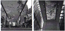
Figure 6. The LED display ceiling art (Tomitsch et al. p.101) in a Beijing shopping mall (left) and the multimedia sky above the winter garden of the Bertelsmann residence in Berlin (right). The ceiling may serve as a physical surface for information visualization. Tomitsch, Grechenig, Vande Moere, & Renan* (2008, pp. 100-105) present a notion of 'information sky' based on:
(1) The metaphor of the natural sky, (2) Historical examples of ceiling art (such as paintings in Altamira cave or Medieval and Renaissance frescos), and (3) Recent computing paradigms. Particular models employed in computing include Mediatecture (such as large-screen displays in public spaces fo display of visualizations of data, weather, or stock data, for example), Ubiquitous computing technology (user-driven applications allowing interaction over a distance), and Ambient display acting at the periphery of human attention. The authors define three categories for the information sky. Contextual information, based on the concept of ambient display, provides awareness of information such as weather conditions. Navigation and guidance within architectural environment using navigational cues on the ceiling provides a sense of orientation and directions toward exits. Storytelling – short dialogues inform people about historical events or conversations that happened in that space.
Videos. Sphere: two visualizations by Petersen, Canig. Interactive information visualization applications in terms of graphics performance and interactivity have not yet been investigated in a context of browser-based application platforms. Web browser based applications have become very popular in many domains, and the interactive information visualization developers must choose the browser-based applications knowledgeably. Lammarsch, Aigner, Bertone, Miksch, Turic, & Gärtner* (2008, pp. 194-199) assess browser-based programming platforms by comparing server-based rendering, Java applets, Flash, and Silverlight in terms of their run capability, rendering graphics primitives, user-controlled animation, user interaction, communication with a server, stability, and experience. The authors consider server-based rendering, Flash and Java as safe bets. Applications for mobile devices such as handhelds and smart phones make easy to use them as desktop applications. Usage of information visualization techniques reduces limitation caused by a small visual area for analysis, and enhances the presentation, search, and analysis of data. Clayton et al.* (2008, pp. 264-269) present a data analysis tool for mobile devices that is characterized by portability, scalability and code reuse. Coordinated views enhance the user's perception over data and diminish difficulties caused by a small display size. The authors’ visualization techniques include the scatterplot graph with the data geo-referenced in the maps, and the treemap visualization of hierarchical structures. Figure 7. Gabriele Peters. Dark Days - Prague: isolation of the modern human being
Design Visualization
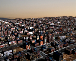
As Andrew Vande Moere* stated earlier (2005), “there is empirical evidence showing that designers use information visualization as a creative concept for determining the design outcome. Vice versa, interdisciplinary concepts, such as design cognition, user engagement, aesthetics, and art, can enhance information visualization. Current trend of information aesthetic visualization is focused on employing visual and interactive aesthetics to represent data in pleasurable and intelligible way. While discussing contemporary methods that represent abstract information in a physical way, Vande Moere* (2008, pp. 469-474) introduces five different degrees of ‘data physicality’, which differ in the level of abstraction of how data is mapped and perceived by human senses: ambient display, pixel sculptures, object augmentation, data sculptures, and alternative modality. The author stresses the potential of information visualization as a communication medium in its own right, which proliferates beyond the ubiquitous pixel-based, light-emitting surfaces of today. Figure 8. Tim Portlock. Images created in a 3D modelling application after abandoned buildings. A series of prints about the decline of urban space. Non-photorealistic rendering (NPR) is a relatively new field that focuses on viewer engagement by the use of stylization, abstraction, and expressiveness (Gatzidis, Papakonstantinou, Brujic-Okretic, & Baker*, 2008, pp. 475-480). Evaluation studies of such approaches support the developments in NPR techniques. The most notable include psychological, architectural, and medical applications, space perception in immersive environment, depiction with the use of texture, learning applications, and visualizing natural phenomena. New techniques in visualization design that may aid comprehension in analysis of complex data include methods such as mechanical, symbolic, and natural analogies (Brath, 2008, pp. 481-484). Creating new visualizations may result from computational generation or designs done by information designers with the use of analogy (mechanical, natural and biologic, or iconic analogies) and metaphors. Challenges associated with creating novel visualizations include metaphor entrapment and validation of the implementation effectiveness. Figure 9. Hans Dehlinger. Quadrat 60-60-2. Generative line oriented pen-plotter pencil drawing. Knowledge Domain Visualization Remo Burkhard introduced “Knowledge Visualization” as the name for
a field that investigates the use of visual representations to transfer
knowledge between at least two people. Then he proposed, with Martin Eppler, a
systematic “Knowledge Visualization Framework.” They suggested applying the
understanding of the field as a problem solver, not only a meta-science. Agent-based
crowd simulation tools have been primarily used in architecture and urban
planning for analytical purposes, such as the simulation of pedestrians or fire
escape scenarios in buildings. Because of the high cost-benefit ratio, they
were only rarely used for communication purposes, for example for marketing
purposes. To bridge the fields of architecture and commercial crowd simulation,
Burkhard, Bischof, & Herzog* (2008, pp. 403-408)
discuss crowd simulations for analytical purposes and case studies done with
commercial software Massive. They consider this relevant for architects, urban
designers, communication and PR experts, and for researchers in the fields of
architecture, knowledge visualization, communication science, and agent-based
simulations.
Figure 10. Mark Stock. “p71-169” The emerging form of a blob of fluid. Simulations of the self-interaction of an initially-spherical fluid interface and tracked its evolution into ever-more complex forms. Francis T. Marchese* (2008, pp. 75-81) explores early visualizations, for instance, the development of the chemical table, with a history of over 300 years, as the textbook case of information visualization. The quality of the periodic table of elements as an early visualization achievement inspired Ralph Lengler and Martin J. Eppler* to create a periodic table of 100 visualization methods. Also, Visual Literacy.org* published the “Interactive Knowledge Maps of Tools, Books, Researchers, Success Factors, and Methods in the Visualization Field.”
Figure 11. LiQuin Tan. Rusty Faces. Large-scale printing on metal materials In their article "Seven Types of Visual Ambiguity: On the Merits and Risks of Multiple Interpretations of Collaborative Visualizations" Eppler, Mengis, & Bresciani* (2008, pp. 391-396) examined visual ambiguity. Visuals catalyze collaboration. Ambiguity or the openness to multiple interpretations typifies visualizations such as sketches, diagrams, visual metaphors, etc., sometimes causing misunderstandings but often offering the potential to reveal new insights, facilitate ad-hoc discoveries, reframe issues, increase identification, or stimulate group sense making. William Empson wrote, “'Ambiguity' itself can mean an indecision as to what you mean, an intention to mean several things, a probability that one or other or both of two things has been meant, and the fact that a statement has several meanings” (Empson, 1932, 5, citation after Eppler et al., 2008, pp. 391-396). Thus, an arrow can be used to represent a vector (with position, orientation, and magnitude), a transition, a designator (i.e. pointing to an object), or a casual or temporal relationship. Two simple examples of intended perceptual (visual) ambiguity are: a picture of a duck that becomes a rabbit (Jastrow, J., 1899, The Mind's Eye, Popular Science Monthly, Vol.54, pp. 299-312) and an old lady that can also be seen as the profile of a young one (Boring, E. G., 1930, A New Ambiguous Figure, American Journal of Psychology, Vol. 42, p. 444). Roland Barthes performed semiotic analyses of the rhetoric of images that he considered polysemic (with many messages).
Figure 12. John Antoine Labadie. Biodendrite_groupXX. One of visualizations in the fields of chemistry, mathematics, physics, and nanotechnology The connotations of the image depend on the context of the image and the characteristics of the viewer. Ambiguity allows for flexibility over time, re-interpretations, and the coexistence of several perspectives. It can become strategic (as a communication device) or perceived (unintentional). Visual ambiguity in the group contexts is a relational variable that depends on three elements (categories): the visual (properties of the image), the people interpreting the image, and the interaction among the people through the visual (according to Eisenberg, 1984, a combination of source, message, and receiver factors). The authors discuss seven types of visual ambiguity under these three categories: iconic, symbolic, and indexical ambiguity (belonging to the property of the visual category), interpreter background and familiarity (belonging to the property of the people), focus, and scope ambiguity (belonging to the interaction category).
Figure 13. Helen S. Golden. IDEA of Beach – A series of IDEAS. Cultural Heritage Knowledge Visualization Because the practice of
visualization of the digital cultural heritage is well-established, Flynn* (2008, pp. 447-452) stresses that digital
cultural heritage needs to reflect contemporary interpretative practices besides
the material data. Material culture has usually been presented as high quality
digital artifacts, their production drawn on the potential for augmented
visualization offered by mobile technologies, game engines, and responsive
environments. While leading research in interpretative heritage has
incorporated the hermeneutic aspects of previously lived cultures, there have
been less recognition of the importance of the users’ role in the formation of
cultural knowledge. The author investigates the processes of knowledge
formation and phenomenological research in archaeology in the light of theoretical
readings on perception, and points to the need to devise alternative methods
for the design and production of an interpretative digital cultural heritage.
Such methods detail the generative potential of a complex process rather than
the replication of a complex structure.
Phenomenological archeologists put emphasis on movement and spatial practice, with motion, vision, and comprehension being inseparable in the somatic space of a body. Also, the phenomenological concept of landscape as a factor in knowledge formation describes the creating and experiencing the perception of the environment through the manner it is approached and sensed. The somatic method outlines the encounter between the human body and prehistoric architectural space, by capturing somatic impulses and affective responses made evident by performance. In a similar way, Tilley, and then Girot and Truniger (2006) stress that to understand the specific situation of a walking perceiver, visualizations of landscapes must include dynamic parameters from the vantage point of the pedestrian.
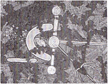
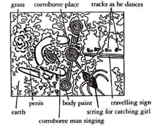
Figure 14. Luz del Carmen. Changes Indigenous knowledge visualization exemplifies the ways in which different people organize data in diverse ways, often involving conveying the meaning that is dependent on the context in which it is used. Australian Aboriginal art can be seen as survival topographic maps and also the cultural heritage survival maps with clear parallels in the iconography of secret sacred motifs (Wyeld*, 2008, pp. 439-446, fig. 15a, b). Australian Aboriginal art, that denotes the means of which particular acts are performed, uses numerous media including tactile painting of petroglyphic forms in sand (involving performative art with dance and songs) and acrylic painting on board, often serving as the storytelling navigation aid.
Figure 15a. Ngarlu Love Story, Clifford Possum, Tjapaltjarri (Acrylic on canvas). A story of forbidden love. Figure 15b. Annotation of Ngarlu Love Story. Visualization of knowledge domain of Australian Aboriginal people is achieved in contextualized nonlinear stories with the meaning dependent on traditional landscapes and knowledge practices. The viewer’s experience becomes both collaborative and performative, when the storyworld unfolds real-time narratives involving Elders and the ancestral spirits of the landscape and supports narratives about land ownership issues, spiritual knowledge, and historic and oral stories (Pumpa & Wyeld, 2006). Cultural heritage survival maps shed new light on understandings of the indexicality and aid to form a theory of the cultural specificity of the conventions used and their role as storytelling navigation aids.
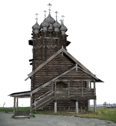
Figure 16. Daria Tsoupikova. Passing excellence. Visualization of the world famous Kizhi site as an interactive 3D virtual environment. A 3D model of the 1764 Church of the Intercession and the Belfry. The Kizhi ensemble is included in the List of Most Endangered Sites of the World Monuments Watch protected by World Heritage List of UNESCO. Architecture can be considered a transition from an initial idea of architecture to its realization that traces out the complexity of the process (Giordano et al.*, 2008, pp. 433-438). The authors propose the management, in a hypertext, of drawings, surveys, maps and historical iconography, real and digital movies of CAD reconstruction (taking, as a case study, the ecclesiastical architectural heritage of the Padua historic centre. The authors recognize the importance of knowledge of configurative geometry for creative thinking, scientific knowledge, and practice. They also attribute to a geometric knowledge a founding role for displaying knowledge of the cultural heritage. This knowledge allows processing manual and digital graphics and constructing motion images. Moreover, flexible geometry still ensures achieving a high level of expressive capacity aimed at both the documentation and the design of complex spaces and structures. This instrument for representation is not only a way of imitating reality but has an enormous analytical/cognitive potential as a cognitive medium able to create possible worlds. A relational database of the cultural heritage contained in ancient maps and charts, which are already preserved in the main Spanish collections, archives, and libraries, has been designed and implemented by Chias and Abad* (2008, 4pp. 53-457). Initiation of this project is aimed to bridge the gap between the routine use of texts and writings and the seldom-applied analysis of old cartographic documents showing the historical evolution of the territories and landscapes. The database provides the possibility to access to a high-resolution digital image of each ancient cartography document or a map. The personalized queries to the database will allow the scholars and searchers to visualize the document together with its main features. The Physical Review Dataset created by Herr II, Duhon, Börner, Hardy, & Penumarthy* (2008, pp. 421-426) is the first map of 113 years of bibliographic data from the American Physical Society. The 389,899 documents are laid out in a two-dimensional time-topic reference system. The citations from 2005 papers are over laid as flow maps. The authors rendered this visualization at a 24" x 30" canvas at 300 dots per inch (DPI).
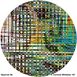
Figure 17. Corinne Whitaker. Squircle 46. Digital 2D painting. Kimono is a key point in Japanese culture. Ching-jung Lin and Jhong-Jyun Guo* (2008, pp. 458-461) accomplished a study of kimono design aimed at the kimono pattern culture conservation. The authors collected different kimono patterns to analyze and induce their shape grammar and then build a design system of kimono pattern based on this grammar. This system provides information concerning visualized patterns such as pattern elements (color, alignment, and etc.), enabling the customers to choose the style they prefer, so they get involved in the design process. The pattern elements generated by the customer’s likes are incorporated into the kimono pattern grammar that is constructed and refined on the basis of the results of this design system. The refined grammar can be used to analyze the existing kimono patterns. Through the continuing refinement and analysis of the kimono grammar, the authors traced back the history of a kimono by its pattern, and, through generative design, made it possible to preserve the cultural assets – the kimono pattern, its design knowledge, and Japanese cultural heritage.
Video. Animation by Brian Leister. Photographs of art works and photographs by themselves are used in inventories describing Italy’s artistic heritage (Pigozzi*, 2008, pp. 462-465). In spite of some political discourses, academic constraints, and cross-disciplinary inflexibility, photographs have now come to be considered part of our cultural heritage. With possible quality and faithfulness of an image, photographic reproductions augment the cultural heritage and should not be confused with plagiarism. The author poses a need to create interactive network offering users online access to cultural resources and shared heritage through the digitalization of art collections belonging to archives, libraries, and museums. This task requests digitizing and archiving photographs, and then interactive cataloguing based on coherent descriptive strategies.
Figure 18. Gloria DeFillips Brush. Reconstituting. Layered and unflattened digital master files show an opened book as the recurring connotative premise and arena for interactions of language, objects, and pictures. Web Mining and Open Source Intelligence Open source information comes from publicly available sources that
are not covert or classified. Open source intelligence is a discipline that
refers to finding, selecting, and analyzing information from publicly available
sources.
Advances in
information technology made open sources more accessible, but the raw data is
heterogeneous for type (web pages, claims, crime reports), source (Internet, Intranet
- a private computer network accessible only to authorized persons, database,
etc.), protocol (HTTP - Hypertext Transfer Protocol, HTTPS - Hypertext
Transfer Protocol over Secure Socket Layer, FTP - File Transfer Protocol, GOPHER - a distributed document search and retrieval network
protocol, IRC - Internet
Relay Chat, NNTP - Internet Relay Chat, etc.) and language used. Information retrieval is limited by insufficient
keywords and diverse linguistic and cultural backgrounds. Neri and Pettoni* (2008, pp. 314-320) describe a Stalker, a
Multilingual Text Mining platform for open source intelligence that provides
deep semantic search and enables analysis of great volumes of heterogeneous
documents.
Figure 19. Philip Saunders. Lumen Triptych. Digital photography, image processing, painting, and compositing, to create images of the movement of light through dark, as an observer travels through time and space. Identifying social communities is a growing research area in the open source intelligence and Web mining domain. Researchers concentrate on customer relationships, or on identifying terrorist groups. Information can be derived from the Call Detail Record (CDR) data from telecommunication companies. Data include customers' calling destination numbers, duration and frequency for each number for a given period of time. Kianmehr and Alhajj* (2008, pp. 308-313) discuss application of cluster analysis to identify calling patterns in communities. Mega-collaboration of great numbers of people, supported by information and communication technology, needs a tool that would let coordinate and link activities of sub-teams, enable teammates to visualize each other's mental models, and give the means to visualize efficiently the "big picture" by individual teams. Each sub-team can develop its own model of its part of the task, with the aid of web-based software agents. Agents support back-end processes, while human-computer interaction (HCI) visualization techniques must support the front-end process. Newlon, Faiola, and MacDorman* (2008, pp. 509-514) report the progress in designing and testing a prototype of mega-collaboration interface. The second-generation interface is being implemented, and a novel agent-based interface is being planned.
Figure 20. Laurence Gartel. RETROLG. Early digital work.
GeoAnalytics Geovisual analytics focuses on finding location-related patterns and relationship. Jern et al.* (2008, pp. 200-207) developed a method, based on the Visual Analytics (VA) toolkit within the previously introduced GeoAnalytics Visualization (GAV) framework, that supports the storage of interactive events through snapshots - "memorized interactive visualization views." An analyst can present and share gained insights over the Internet using interactive visualizations embedded in standard HTML documents. The authors demonstrate interactive performance of demanding visualizations in the context of GeoAnalytics and molecular visualization scenarios. Further enhancements (Jern, Rogstadius, Åström, & Ynnerman*, 2008, pp. 362-372) facilitate scaling geovisual analytics of large spatial geospatial data. These are: 1) texture-based geographic mapping that exploits GPU-based rendering performance applied to overview + detail views, 2) statistical methods embedded in parallel coordinates, 3) aggregated dynamic grid maps. Large-scale virtual city 3D models transport huge amounts of different information, such as facade textures, aerial photographs, infrastructure models, and city furniture, thus creating information overload. The interactive focus + context visualization (Trapp, Glander, Buchholz, & Döllner*, 2008, pp. 356-361) facilitates the exploration of complex information spaces. This is possible due to the use of the 3D generalization lenses that direct users attention to the detailed focus region, while showing the generalized context information. Color-coding is widely used for scalar data that hold only one value at a time. To generate expressive and effective visual representations, it is extremely important to carefully design the mapping from data to color. To create expressive and effective visual representations, color-coding strategies are introduced (Tominski, Fuchs, & Schumann*, 2008, pp. 373-380), that adapt the color mapping function to support tasks like comparison, localization, or identification of data values. Shipping companies must consider many parameters before making decisions concerning many ships, cargoes, and routes. The Visualize Performance Data (VISPER) application (Lundblad, Jern, and Forsell*, 2008, pp. 381-388) combines InfoVis components with logistics visualization to facilitate decision-making, by gathering insights about the multi-dimensional, multi-source, time-varying and geospatial digital information from voyage analysis.
Figure 21. Bruce Wands. The Buddha Light Painting. A series of abstract images based on the ancient sacred geometry that dates back several thousand years and forms the basis for many types of Buddhist art.
Semantic Web
The semantic web has been described by the W3C director Tim Berners-Lee as an evolving extension of the World Wide Web, where information is understandable by computers, so they become capable of finding, sharing, combining, and analyzing all the data on the Web (Semantic Web*, 2009). Web content comprises text documents (composed mostly of HTML), images (mostly graphics), audio and video files, animations, and any conceivable materials such as data, applications, Web pages, e-services, or archived e-mail messages. Semantic web involves examining internal content of the relations in a network of concepts, and uses words and symbols as labels for data. Thus, the semantic web comprises philosophy, design principles, collaborative working groups, and technology (Semantic Web, 2009). Semantic network represents semantic relations between the concepts and is often used to represent knowledge. It is a directed or undirected graph that consists of vertices representing concepts, and edges defining relations between the concepts. Google estimates around 427k RDF documents on the Web and other sources list even more, up to 27m documents (Kinsella, Bojars, Harth, Breslin, & Decker*, 2008, pp. 179-184). Scientists develop intuitive way of viewing current usage of RDF vocabularies. Kinsella et al. present a system allowing a user to view the most frequently occurring namespaces and classes in a large Semantic Web dataset, with the main linkage patterns that exist between them. Semantic network technology enables constructing collective scholarly knowledge and expertise from publicly available data. POLYPHONET – a social network mining system (Oka and Matsuo*, 2008, pp. 349-355) is used to extract relations of researchers, to detect groups of researchers, and to obtain keywords for a researcher.
Figure 22. Ina Conradi. Natural SystemsTen. Ontology is a basic component of the Semantic Web, a document or file that formally defines terms and relations among terms. Ontologies collect information about objects, their classes, properties, relations, and changes in properties and relations, and thus help the users understand, exchange, analyze or share knowledge of a specific domain. Visualization of the structure of ontologies helps users understand and manipulate very large and complex ontologies. Visualization of instances related to ontology structure represents the real world objects, for example, curricular structures and instances are needed to represent individual college courses. Kriglstein and Motschnig-Pitrik* (2008, pp. 163-168) present Knoocks (Knowledge Blocks), a visualization approach focused on instances related to ontologies’ structure, and they compare it with Jambalaya and CropCircles.
Figure 23. Jacquelyn Ford Morie. Morie’s Memories Of. The work All My Avatars: Information Visualization of my Self: how online and social worlds have opened up new modes of expressing and visualising information about our Self. Applications of Graph Theory
Graph drawing for visualization finds a growing number of applications in various disciplines, and many attempts aim to produce aesthetically pleasing visualization of graphs, many times as force directed graphs with the edges of the graph having equal length, and as few crossing as possible. Kumar, Zhang, & Wang* (2008, pp. 38-43) developed the E-Spring algorithm for visualizing clustered directed acyclic graphs (DAGs) without node overlapping. In this visualization nodes are modeled as physical bodies, the charged particles with weights, and edges are represented as springs that provide forces between the bodies. With this approach, a final drawing is derived by adjusting the positions of the nodes according to a combination of spring forces and repulsive forces derived from electrostatic forces between the nodes. The two basic problems of graph drawing – drawing of nodes and drawing of edges – are often handled by one algorithm, which finds suitable positions for both nodes and edges (Dokulil and Katreniakova*, 2008, pp. 626-631). Figure 24. Lane Last. Universal Path. Computer-mediated Art. Several standards (formal specifications) accompany the usage of semantic web, for example, the W3C based standards: Resource Description Framework RDF, Web Ontology Language OWL, URI, or HTTP. The Resource Description Framework (RDF)* is a web metadata language that describes information about web resources and the semantic data in the Web. Its abstract syntax reflects graph-based data models and formal semantics in the Web. The RDF data can be presented visually as an oriented, labeled graph, so it gives the user an idea about data content and structure. However, there are millions of nodes and edges. To handle the data, users cannot display the whole data but rather have to draw sub-graphs and navigate the data. Dokulil and Katreniakova* (2008, pp. 26-31) designed and implemented a visualizer – a user-friendly visual navigation technique, applying animation with the use of the Trisolda semantic web infrastructure. Users make their navigation trees and mental maps in their minds. As the RDF data format – the basic format for the semantic web – is by its very nature a graph, the authors (Dokulil and Katreniakova, 2008*, pp. 191-193) created an RDF visualizer that allows some basic support to design a visual query of the data based on directed labeled graphs. The authors (Dokulil and Katreniakova, 2008, pp. 626-631) present also an algorithm for drawing the edges in RDF visualization, which draws only the edges, no matter what the positions of the nodes are. The algorithm is needed when positions of nodes are fixed, for instance, defined by the user or the exact position of the nodes is somehow significant.
Figure 25. Karin Kuhlmann. Big Thing. Created with Ultra Fractal 4. Euler diagrams – collections of labeled closed curves – represent information about between sets and their relationships; they have numerous applications including: visualizing biological data, diagrammatic logics, and visual database querying. Until now Euler diagrams must be laid out by hand. Rodgers, Zhang, Stapleton, & Fish* (2008, pp. 585-593) introduce software for a novel automated layout of Euler diagrams, a method for embedding such diagram from wellformed dual graphs (having no triple points, concurrent curves, disconnected zones, or non-simple curves). A wiki system is used for semantic annotation, comments, discussions, versioning, notification, and full-text search (Giereth & Ertl*, 2008, pp. 185-190). A wiki is a page or collection of Web pages designed to enable anyone who accesses it to contribute or modify content. Wikis are often used to create collaborative or community websites. The collaborative encyclopedia Wikipedia is one of best-known wikis (http://en.wikipedia.org/wiki/Wiki). The authors, Giereth & Ertl (2008, p. 185-190) use semantic wikis for data search and annotation, integrating interactive visualizations into semantic wikis. A semantic wiki has an underlying model of the knowledge described in its pages. Semantic wikis* allow the ability to capture or identify further information about the pages' (metadata) and their relations. Supporting research in historical archives. Historical archives take form of digital libraries enhanced with the incorporation of semantics. The tools used for designing digitalized historical archives are based on an ontology that enables an overview of the domain of interest, browsing by displaying texts and images, and querying by making a specific request for information from a database or choosing parameters from a menu. The collection of historical data includes research in primary (such as archives, mail, and books) and secondary materials. There is a need for tools for location and visualization of such information, along with a study on the users' needs and requirements. Katifori, Torou, Vassilakis, & Halatsis* (2008, pp. 32-37) performed such user study and proposed a set of tools to aid research in the context of historical archives, which present the display restricted to classes and relationships pertaining to a specific time period, visualize a timeline and its evolution, and show interdependencies of historical entities and events.

Figure 26. Bogdan Soban. Flower 2. Generative program based on the deformation of the Mandelbrot fractal. Visual Analytics Visual analytics is the science that supports analytical reasoning facilitated by interactive visual interfaces (Thomas & Cook, 2008, 2006). Integration of explorative data analysis tools and interactive visualization tools enable analytical reasoning and collaboration. Visual analysts developed a number of interactive visualization tools, many of them designed from the users’ point of view. Pixel-based visualization techniques presenting the long-term behavior of large amounts of financial data for long-term investments can support the decision making process for investors on the financial market. A pixel-based paradigm for visual analysis is not restricted to analyzing financial time series data but can be used with any time series data. Ziegler, Nietzschmann, & Keim* (2008, pp. 287-295) present the Performance Matrix, a visualization approach that demonstrates a pixel-based visualization technique that integrates individual preferences of an investor and visually reflects the regions of personal interest.
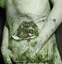
Figure 27. Helen Nicole Kotsis. Skin. Installation. Matkovic, Freiler, Gracanin, & Hauser* (2008, pp. 215-220) present a ComVis, a new visualization technology based on the technology of the coordinated multiple views. As an example, they present a configuration where meteorological data can be examined with eight views, scatter plot, parallel coordinates, histogram, color lines, curves, segmented curve view, and bar charts.
Variables can be described as categorical, ordinal, or interval. A categorical variable (sometimes called a nominal variable) has two or more categories, but one cannot clearly order the variables. There are no operations such as addition or subtraction and no "less than" or "greater than" relations among the nominal numbers. For example, gender (with two categories, male and female), marital status, race, religious or political affiliation, college major, and birthplace are examples of categorical variables measured at a nominal level. Other examples include: geographical location in a country represented by that country's international telephone access code, or the make or model of a car. In ordinal measurement there is a clear ordering of the variables. The numbers called ordinals represent the rank order (1st, 2nd, 3rd etc.) of the variables that are called ordinal variables or rank variables. However, the spacing between the values may not be the same across the levels of the variables. Examples are variables such as economic status (low, medium and high), a mineral hardness scale, or the horse race results. The variable is called an interval variable when the intervals between the values are equally spaced and the differences between pairs of measurements can be compared*. A tag cloud is a type of visualization used to describe a website content. Tag clouds are widely employed in social software (where users can interact and share data) for labeling digital content of various Web 2.0 websites, such as photographs (Flickr, www.flickr.com), videoclips (YouTube, www.youtube.com), and WWW bookmarks (www.del.icio.us). They are also useful in browsing for topics. Tag maps are the text-based visual representations of text in geographical space. Both depict each tag importance, their weight by a font size, color, by popularity, or content. In order to solve such issues as unused whitespace, restriction to certain bounding areas (rectangle, circle), and the overlapping of tags, Seifert, Kump, Kienreich, Granitzer, & Granitzer* (2008, pp. 17-25) present four algorithms that change the tags' visual representation by shifting the font size interval, scaling it, and truncating the tags' strings. In terms of its aesthetic value, evaluation of the algorithm usability evidenced the primacy of the shift-scale-trunc combination of the steps.
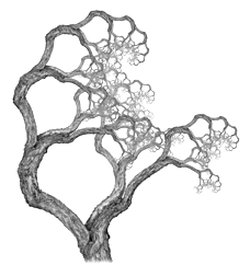
Figure 28. Robert Fathauer. Fractal Tree No 4. Graphical iteration of an arrangement of a small portion of a photograph of a tree. Summary and Conclusion Topics selected for this review reflect only a few selected themes related to the whole field of visualization, information visualization, visual analytics, visual data mining, and other fields that are now growing and get a lot of attention. Also, they do not cover the broad spectrum of the 12th International Conference on Information Visualization in London, UK. Specialized sessions held at the Conference included: themes related to information visualization: theory, techniques, usability, applications, web visualization, IV-coordinated and multiple views in exploratory visualization; visual analytics: visual data mining and analytics, open source intelligence and web mining, geo-analytics; themes related to knowledge visualization: knowledge domain visualization, cultural heritage knowledge visualization, design visualization, HCI-interaction design for knowledge visualization, visualization in software engineering, and applications of graph theory. Proceedings of the 12th International Conference on Information Visualization, edited by Ebad Banissi, Liz Stuart, Mikael Jern, Gennady Andrienko, Francis T. Marchese, Nasrullah Memon, Reda Alhajj, Theodor G. Wyeld, Remo Aslak Burkhard, Georges Grinstein, Dennis Groth, Anna Ursyn, Carsten Maple, Anthony Faiola, and Brock Craft, have been published by IEEE Computer Society Press.
Figure 29. Dena Eber. References Bourqui, R., & Jourdan, F. (2008). Revealing Subnetwork Roles using Contextual Visualization: Comparison of Metabolic Networks. In iV, 12th International Conference on Information Visualisation, London, UK (pp. 638-643). IEEE Computer Society Press. Brath, R. (2008). Use of Analogy in Synthesizing Novel Visualizations. In iV, 12th International Conference on Information Visualisation, London, UK (pp. 481-484). IEEE Computer Society Press. Burkhard, R., Bischof, S. & Herzog, A. (2008). The Potential of Crowd Simulations for Communication Purposes in Architecture. In iV, 12th International Conference on Information Visualisation, London, UK (pp. 403-408). IEEE Computer Society Press. Card, S., Mackinlay, J. & Shneiderman, B. (1999). Readings in Visualization: Using Vision to Think. San Francisco, CA: Morgan Kaufman. Chias, P., & Abad, T. (2008). Visualising Ancient Maps as Cultural Heritage: A Relational Database of the Spanish Ancient Cartography. In iV, 12th International Conference on Information Visualisation, London, UK (pp. 453-457). IEEE Computer Society Press. Ching-jung Lin, & Jhong-Jyun Guo (2008). A Design Supporting System for Kimono Pattern Preservation. In iV, 12th International Conference on Information Visualisation, London, UK (pp. 458-461). IEEE Computer Society Press. Clayton, S., Pinheiro, V., Meiguins, B. S., Simões, A., Meiguins, G. & Almeida, H. L (2008). A Tourism Information Analysis Tool for Mobile Devices. In iV, 12th International Conference on Information Visualisation, London, UK (pp. 264-269). IEEE Computer Society Press. Cottam, J. A., & Lumsdaine, A. (2008). Stencil: A Conceptual Model for Representation and Interaction. In iV, 12th International Conference on Information Visualisation, London, UK (pp. 51-56). IEEE Computer Society Press. Craft, B., & Cairns, P. (2008). Directions for Methodological Research in Information Visualization. In iV, 12th International Conference on Information Visualisation, London, UK (pp. 44-50). IEEE Computer Society Press. Dokulil, J., & Katreniakova, J. (2008). Navigation in RDF Data. In iV, 12th International Conference on Information Visualisation, London, UK (pp. 26-31). IEEE Computer Society Press. Dokulil, J., & Katreniakova, J. (2008). RDF Query Generator. In iV, 12th International Conference on Information Visualisation, London, UK (pp. 191-193). IEEE Computer Society Press. Dokulil, J. & Katreniakova, J. (2008). Edge Routing with Fixed Node Positions. In iV, 12th International Conference on Information Visualisation, London, UK (pp. 626-631). IEEE Computer Society Press. Empson, W. (1932). Seven Types of Ambiguity. Cambridge: Cambridge University Press Eppler, M. J., Mengis, J., & Bresciani, S. (2008). Seven Types of Visual Ambiguity: On the Merits and Risks of Multiple Interpretations of Collaborative Visualizations. In iV, 12th International Conference on Information Visualisation, London, UK (pp. 391-396). IEEE Computer Society Press. Flynn, B. (2008). Augmented Visualisation: Designing Experience for an Interpretative Cultural Heritage. In iV, 12th International Conference on Information Visualisation, London, UK (pp. 447-452). IEEE Computer Society Press. Gatzidis, C., Papakonstantinou, S., Brujic-Okretic, V. & Baker, S. (2008). Recent Advances in the User Evaluation Methods and Studies of Non-Photorealistic Visualization and Rendering Techniques In iV, 12th International Conference on Information Visualisation, London, UK (pp. 475-480). IEEE Computer Society Press. Gaudin, B. & Quigley, A. J. (2008). Interactive Structural Clustering of Graphs based on Multi-Representations. In iV, 12th International Conference Information Visualisation, London, UK (pp.227-232). IEEE Computer Society Press. Giereth, M., & Ertl, T. (2008) Visualization Enhanced Semantic Wikis for Patent Information. In iV, 12th International Conference on Information Visualisation, London, UK (pp. 626-631). IEEE Computer Society Press. Giordano, A., Bifulco, L., Lovato, R. & Barnes, C. (2008). Hypertext of the Ecclesiastical Architectural Heritage of the Padova Historic Centre. In iV, 12th International Conference on Information Visualisation, London, UK (pp. 433-438). IEEE Computer Society Press. Girot, C., & Truniger, F. (2006). The Walker‘s Perspective: strategies for conveying landscape perception using audiovisual media. Proceedings of the 10th International Conference on Information Visualization, (pp. 225-231). IEEE Computer Society Press. Herr II B. W., Duhon, R. J., Börner, K., Hardy E. F., & Penumarthy, S. (2008). 113 Years of Physical Review: Using Flow Maps to Show Temporal and Topical Citation Patterns. In iV, 12th International Conference on Information Visualisation, London, UK (pp. 421-426). IEEE Computer Society Press. Jern, M., Rogstadius, J., Åström, T. & Ynnerman, A. (2008). Visual Analytics Presentation Tools Applied in HTML Documents. In iV, 12th International Conference on Information Visualisation, London, UK (pp. 200-207). IEEE Computer Society Press. Jern, M., Åström, T., & Johansson, S. (2008). GeoAnalytics Tools Applied to Large Geospatial Datasets). In iV, Proceedings of the 10th International Conference on Information Visualization, (pp. 362-372). IEEE Computer Society Press. Ji Soo Yi, Youn ah Kang, Stasko, J. & Jacko, J. (2007). Toward a Deeper Understanding of the Role of Interaction in Information Visualization. IEEE Transactions on Visualization and Computer Graphics, (pp. 1224-1231). Johansson, S., Jern, M.. & Johansson, J. (2008). Interactive Quantification of Categorical Variables in Mixed Data Sets. In iV, 12th International Conference on Information Visualisation, London, UK (pp. 3-10). IEEE Computer Society Press. Katifori, A., Torou, E., Vassilakis, C. & Halatsis, C. (2008). Supporting Research in Historical Archives: Historical Information Visualization and Modeling Requirements. In iV, 12th International Conference on Information Visualisation, London, UK (pp. 32-37). IEEE Computer Society Press. Kianmehr, K., & Alhajj, R. (2008). Effectiveness of Machine Learning Techniques for Automated Identification of Calling Communities. In iV, 12th International Conference on Information Visualisation, London, UK (pp. 308-313). IEEE Computer Society Press. Kinsella, S., Bojars, U., Harth, A., Breslin, J. G. & Decker, S. (2008). An Interactive Map of Semantic Web Ontology Usage. In iV, 12th International Conference on Information Visualisation, London, UK (pp. 179-184). IEEE Computer Society Press. Kriglstein, S., & Motschnig-Pitrik, R. (2008). Knoocks: New Visualization Approach for Ontologies. In iV, 12th International Conference on Information Visualisation, London, UK (pp. 163-168). IEEE Computer Society Press. Kumar, P., Zhang, K., & Wang, Y. (2008). Visualization of Clustered Directed Acyclic Graphs without Node Overlapping. In iV, 12th International Conference on Information Visualisation, London, UK (pp. 38-43). IEEE Computer Society Press. Lammarsch, T., Aigner, W., Bertone, A., Miksch, S., Turic, T. & Johannes Gärtner, J. (2008). A Comparison of Programming Platforms for Interactive Visualization in Web Browser Based Applications. In iV, 12th International Conference on Information Visualisation, London, UK (pp. 194-199). IEEE Computer Society Press. Lundblad, P., Jern, M., & Forsell, C. (2008).Voyage Analysis Applied to Geovisual Analytics. In iV, 12th International Conference on Information Visualisation, London, UK (pp. 381-388). IEEE Computer Society Press. Marchese, F. T. (2008). The Chemical Table: An Open Dialog between Visualization and Design. In iV, 12th International Conference on Information Visualisation, London, UK (pp. 75-81). IEEE Computer Society Press. Matkovic, K., Freiler, W., Gracanin, D., & Hauser, H. (2008). ComVis: A Coordinated Multiple Views System for Prototyping New Visualization Technology. In iV, 12th International Conference on Information Visualisation, London, UK (pp. 215-220). IEEE Computer Society Press. Neri, F., & Pettoni, M. (2008). Stalker, a Multilingual Text Mining Search Engine for Open Source Intelligence. In iV, 12th International Conference on Information Visualisation, London, UK (pp. 314-320). IEEE Computer Society Press. Newlon, C. M., Faiola, A., & MacDorman, K. F. (2008). Building the Mega-Collaboration Interface: Behavioral, Cultural, and Cognitive Factors in Visualization Support. In iV, 12th International Conference on Information Visualisation, London, UK (pp. 509-514). IEEE Computer Society Press. Oka, M., & Yutaka Matsuo. (2008). Mining Scholarly Semantic Networks from the Web. In iV, 12th International Conference on Information Visualisation, London, UK (pp. 349-355). IEEE Computer Society Press. Pigozzi, M. (2008). Photographs of Artworks: Electronic formatting of knowledge and the Internet. In iV, 12th International Conference on Information Visualisation, London, UK (pp. 462-465). IEEE Computer Society Press. Pumpa, M., & Wyeld, T. G. (2006). Database and Narratological Representation of Australian Aboriginal Knowledge as Information Visualisation using a Game Engine. In Proceedings of the iV, 10th International Conference on Information Visualization, London, UK (pp. 237-2426). IEEE Computer Society Press. Resource Description Framework. Retrieved October 05, 2008, from http://www.w3.org/TR/2004/REC-rdf-concepts-20040210/ Rodgers, P., Zhang, L., Stapleton, G. & Fish, A. (2008). Embedding Wellformed Euler Diagrams. In iV, 12th International Conference on Information Visualisation, London, UK (pp. 585-593). IEEE Computer Society Press. Seifert, C., Kump, B., Kienreich, W., Granitzer, G. & Granitzer, M. (2008). On the Beauty and Usability of Tag Clouds. In iV, 12th International Conference on Information Visualisation, London, UK (pp. 17-25). IEEE Computer Society Press. Semantic Web. Retrieved March 9, 2009, from http://en.wikipedia.org/wiki/Semantic_Web Thomas, J. J., & Cook, K. A. (2006, January/February). IEEE Computer Graphics and Applications, 26(1), 10-13. Tominski, C., & Schumann, H. (2008). Visualization of Gene Combinations. In iV, 12th International Conference on Information Visualisation, London, UK (pp. 120-126). IEEE Computer Society Press. Tominski, C., Fuchs, G. & Schumann, H. (2008). Task-Driven Color Coding. In iV, 12th International Conference on Information Visualisation, London, UK (pp. 373-380). IEEE Computer Society Press. Tomitsch, M., Grechenig, T., Vande Moere, A. & Renan, S. (2008). Information Sky: Exploring the Visualization of Information on Architectural Ceilings In iV, 12th International Conference on Information Visualisation, London, UK (pp. 100-105). IEEE Computer Society Press. Trapp, M., Glander, T., Buchholz, H. & Döllner, J. (2008). 3D Generalization Lenses for Interactive Focus + Context Visualization of Virtual City Models. In iV, 12th International Conference on Information Visualisation, London, UK (pp. 356-361). IEEE Computer Society Press. Vande Moere, A. (2008). Beyond the Tyranny of the Pixel: Exploring the Physicality of Information Visualization. In iV, 12th International Conference on Information Visualisation, London, UK (pp. 469-474). IEEE Computer Society Press. Vande Moere, A. (2005). Form Follows Data: The Symbiosis between Design & Information Visualization. Retrieved February 2, 2009, from http://web.arch.usyd.edu.au/~andrew/publications/caadfutures05.pdf Wiki. Retrieved March 9, 2009, from http://en.wikipedia.org/wiki/Web_content Wyeld, T. (2008). Encoded Cultural Heritage Knowledge in Australian Aboriginal Traditional Representation of Country. In iV, 12th International Conference on Information Visualisation, London, UK (pp. 439-446). IEEE Computer Society Press. Ziegler, H., Nietzschmann, T., & Keim, D. A. (2008). Visual Analytics on the Financial Market: Pixel-based Analysis and Comparison of Long-Term Investments. In iV, 12th International Conference on Information Visualisation, London, UK (pp. 287-295). IEEE Computer Society Press. Notes
*
http://www.graphicslink.co.uk/IV08/. |
||
